


Sep 9, 2024
How To Design eCommerce Emails Like A Pro
How To Design eCommerce Emails Like A Pro
Introduction
It’s no secret that email as a marketing channel has one of the highest ROIs possible.
We’ve all seen the stats floating around… “For every $1 spent on email marketing, brands gain $X” … whether it’s $36, $46, or whatever version of it you subscribe to…
The bottom line is that email marketing is extremely profitable.
But how do we take it one step further?
We’ve all had those conversations with brand owners who tell us email is absolutely CRUSHING it for them…
And sometimes it leaves us scratching our heads wondering what they’re doing differently.
While there are many things that go into making a thriving email channel, one of those things are the emails themselves.
The most optimal anatomy of an eCommerce email will always yield you better results than simply winging it.
That’s what I aim to share with you in this blog: How to create an eCom email like a pro.
If you action even a few of the tips I’m about to share, you'll naturally improve your open rates, click through rates and watch your email channel turn into one of your stronger marketing channels in the mix.
Let’s dive in.
Understanding the Canvas
Before we get into the actual anatomy of the emails, it’s crucial to understand the canvas we have to design on.
According to Litmus (2024), the current email client market share sees:
- Apple at the top, with around 48% market share.
- Gmail in second place with 35% market share.
- Outlook in third place with a far-behind 5%
No matter how far into the future you read this, it’s safe to assume the top 3 aren’t going to change anytime soon, unless something drastic happens.
What does that mean for you?
Design with these 3 clients in mind. If (especially) Apple and Gmail can’t open your emails, you’re in for some serious trouble.
Outlook, while far behind, still covers the third place, so the ideal scenario is to optimize for all 3.
On top of that, it’s crucial to know that:
Mobile is king when it comes to email opens. Most users open emails on their mobile.
What does that mean for you?
Your designs will stand a FAR better chance to convert if you design with a mobile-first approach.
This doesn’t mean you neglect desktop (at all) - rather lead with mobile-first in mind.
Now we’ve got the boring (but important) stats out the way, let’s get to the good stuff.
The designs.
Email Layout Best Practices
Simplicity really is your best friend when it comes to email layout.
Remember, you're not designing a website…
You're crafting a focused message that needs to be digested quickly, AND on multiple devices.
Now, there are a few principles to keep in mind:
Single-Column Layout
We’ve already mentioned that mobile is king. This means single-column layouts are your go-to.
They're easier to read on smaller screens and help maintain a clear hierarchy of information.
Multi-column layouts can work for desktop, but they tend to just fall apart on mobile.
Again, this isn’t a hard and fast rule, but just something to keep in mind when creating emails.
The Inverted Pyramid
Think about an inverted pyramid shape when you set out to structure your content.
Start with the most important information up top, then work your way down to the less important stuff and semantics.
Even if someone doesn't scroll all the way, they've gotten the main message.
That’s your goal.
Because people scan emails, unless they have a VERY high buying temperature.
White Space is Your Friend
As our designer wisely pointed out, "Well-balanced white space is SUPER important."
Don't be afraid of empty space. In fact, you should absolutely embrace it.
It gives your content room to breathe and makes your email more scannable.
A cluttered email is a deleted email.
That’s the mantra.
Clear Sections
Break your email into distinct sections using visual cues like lines, colors, or simply space.
This helps guide the reader's eye and makes the information more digestible.
Hopefully with these visual examples, you get the idea of what a good layout should look like.
But how do you make your email visually appealing and on-brand?
Let’s cover that next.
The Visual Stuff - Colors, Imagery, and Branding
Humans are extremely visual beings.
We often get a subconscious perception of something just by looking at it - and your brand is no different.
People WILL subconsciously judge the quality of your products, service and overall ability to help them through your representation of your branding.
Note the word ‘representation’.
Because many eCommerce brands have great branding, but it isn’t well-represented across all of their marketing channels.
And of all the audits we’ve done inside brand ESP (Email Service Provider) accounts, if there’s ONE area brands tend to continuously fall short…
You guessed it. It’s email.
Here are some crucial things to keep in mind when designing emails that represent your brand:
Color Theory in Action
Our designer hit the nail on the head with the importance of "Complementary Colors / Color Blocking."
Use your brand colors strategically to highlight important sections and create visual interest.
But remember, less is more when it comes to design.
Try not to turn your email into a rainbow explosion.
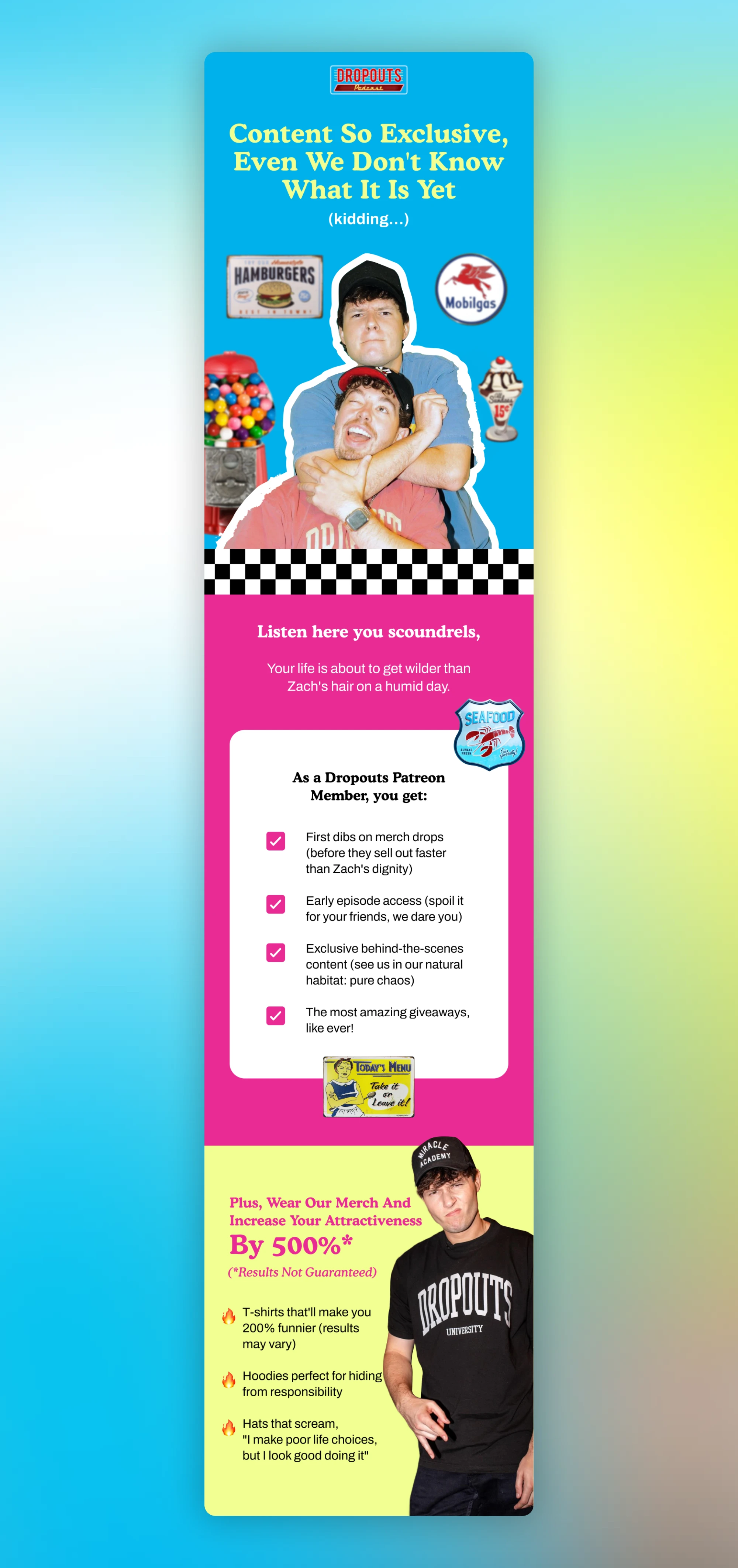
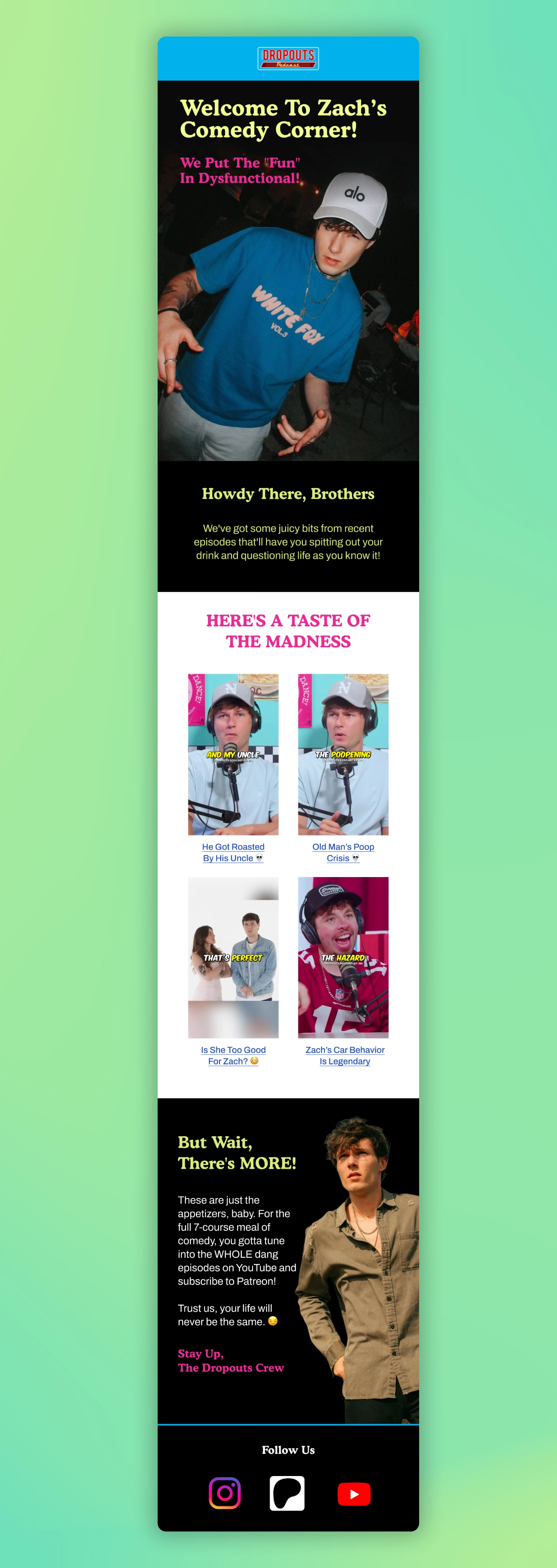
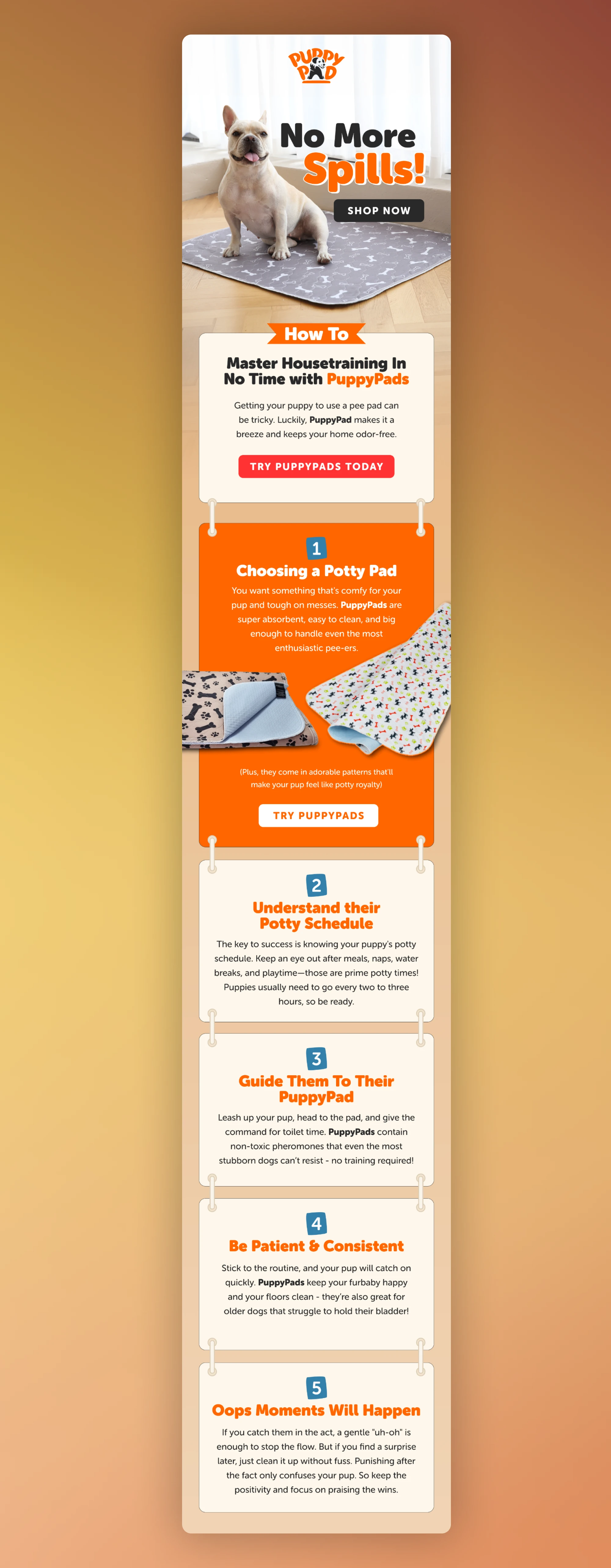
Here’s an example of how we’ve used complementary colors to highlight important sections, while tying everything together with branding in mind.
You can see how using the brands’ colors to highlight important sections causes a visceral effect across the entire creative.
Purposeful Imagery That Sells
"Good Imagery" isn’t just about picking pretty pictures.
It's about using images that tell a story, showcase your product and entice the reader.
It’s your chance at a memorable first impression, and creating a good visual experience.
High-quality product photos, lifestyle images that show your product in use and even well-designed graphics make a world of difference.
Seriously.
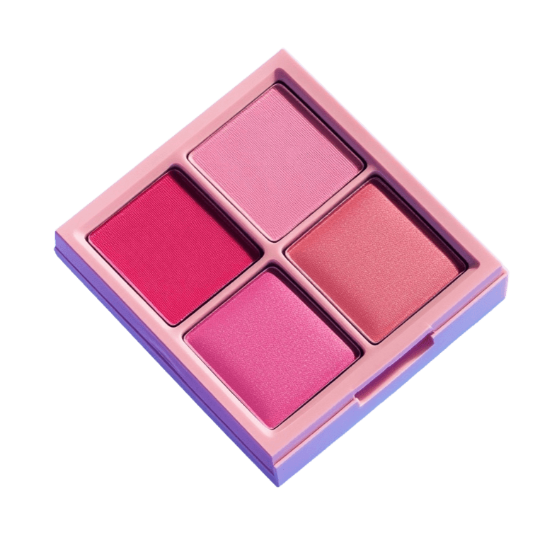
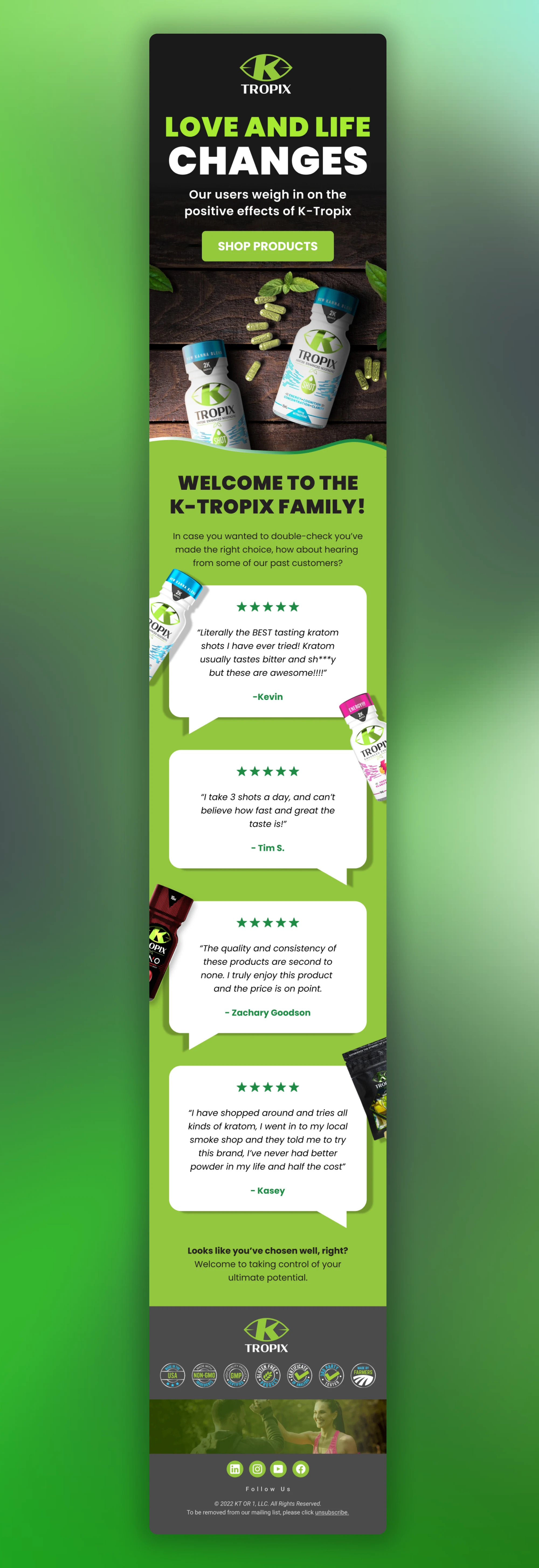
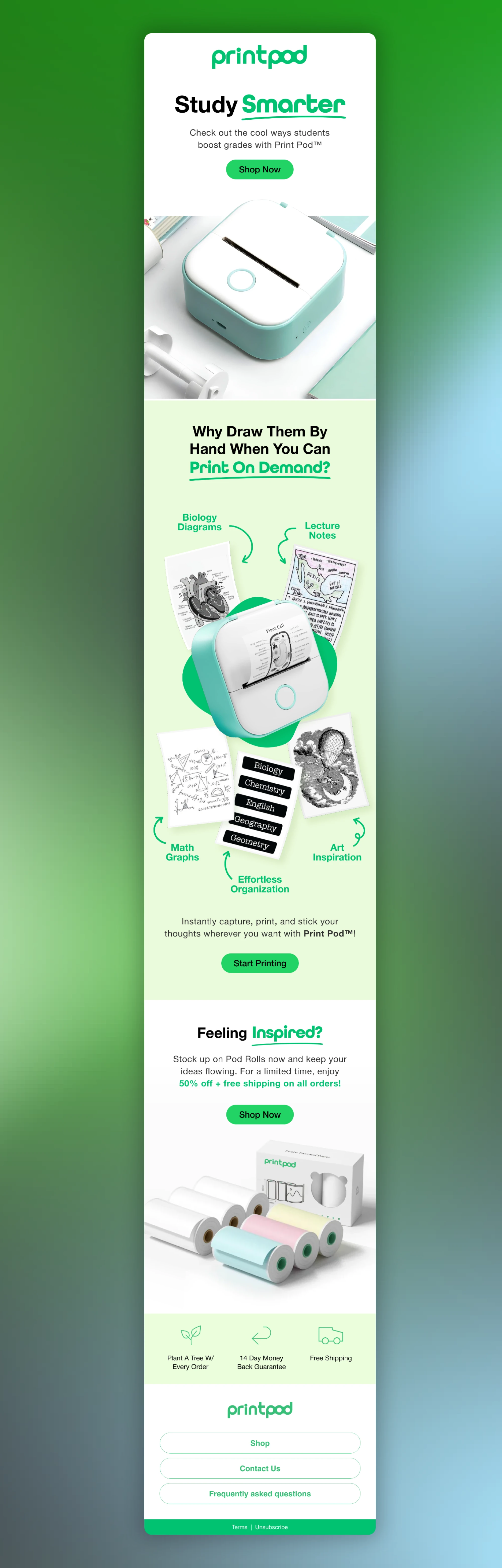
Here’s an example of high quality images that give a lift to the entire email.
It DOES make a difference.
Cohesive Branding
Your emails should be instantly recognizable as coming from your brand.
Use your logo, stick to your brand fonts (or you can use web-safe alternatives for emails), and maintain a consistent look and feel across all your marketing channels.
That is the absolutely key.
Cohesion across marketing channels.
If your ads look different, your website has a different twist, and your emails look a bit different to the rest…
It’s like playing Chinese whispers in your marketing.
And that leads to no sales.
Congruence in messaging across channels is everything…
And make sure not to underestimate congruence in branding across all of your channels too.
Hand in hand they’re an incredible combo for a tight, sales-generating funnel.
Less Is More When It Comes To Content Strategy
Short and Sweet Copy
As our designer emphasized, "Short and Concise Copy" is key.
Your readers are busy.
Respect their time by getting to the point quickly.
Use bullet points, short paragraphs, and clear headings to make your content easily scannable.
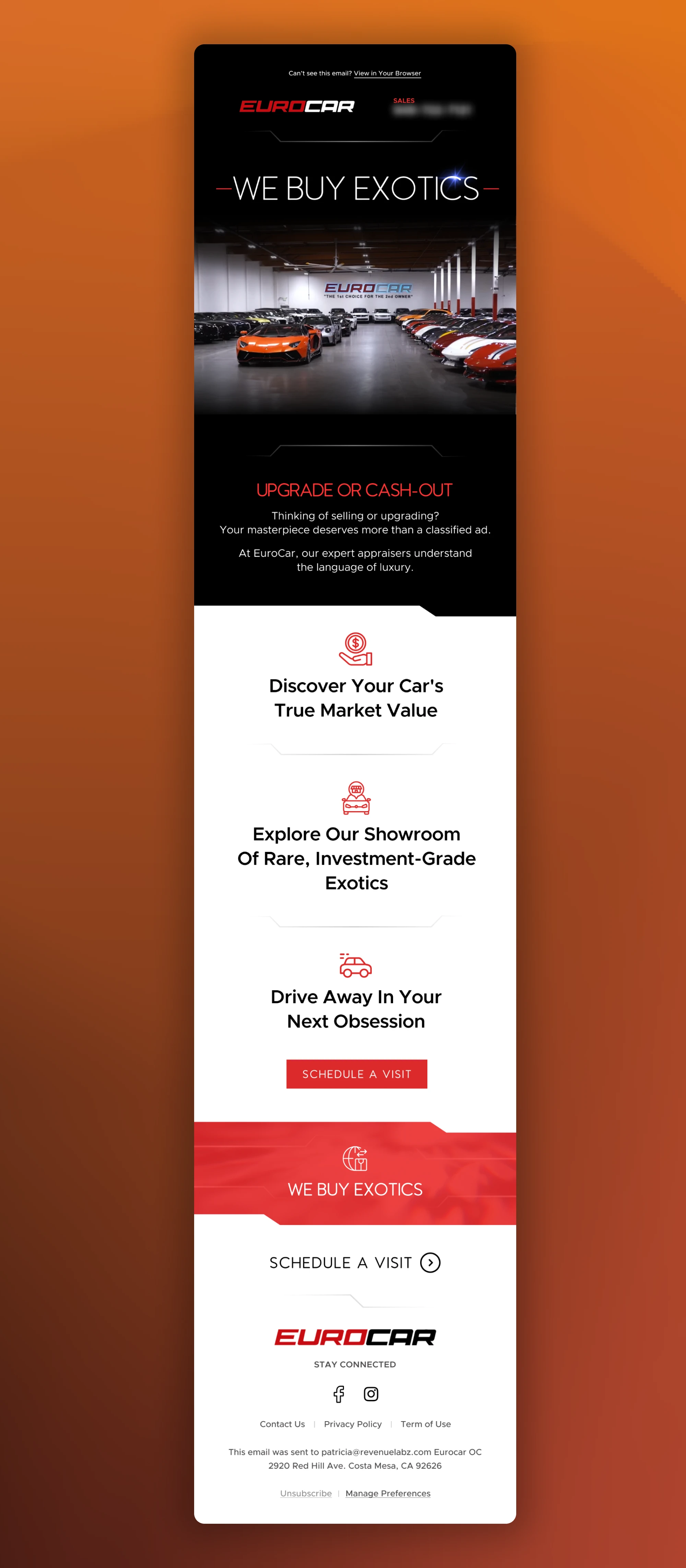
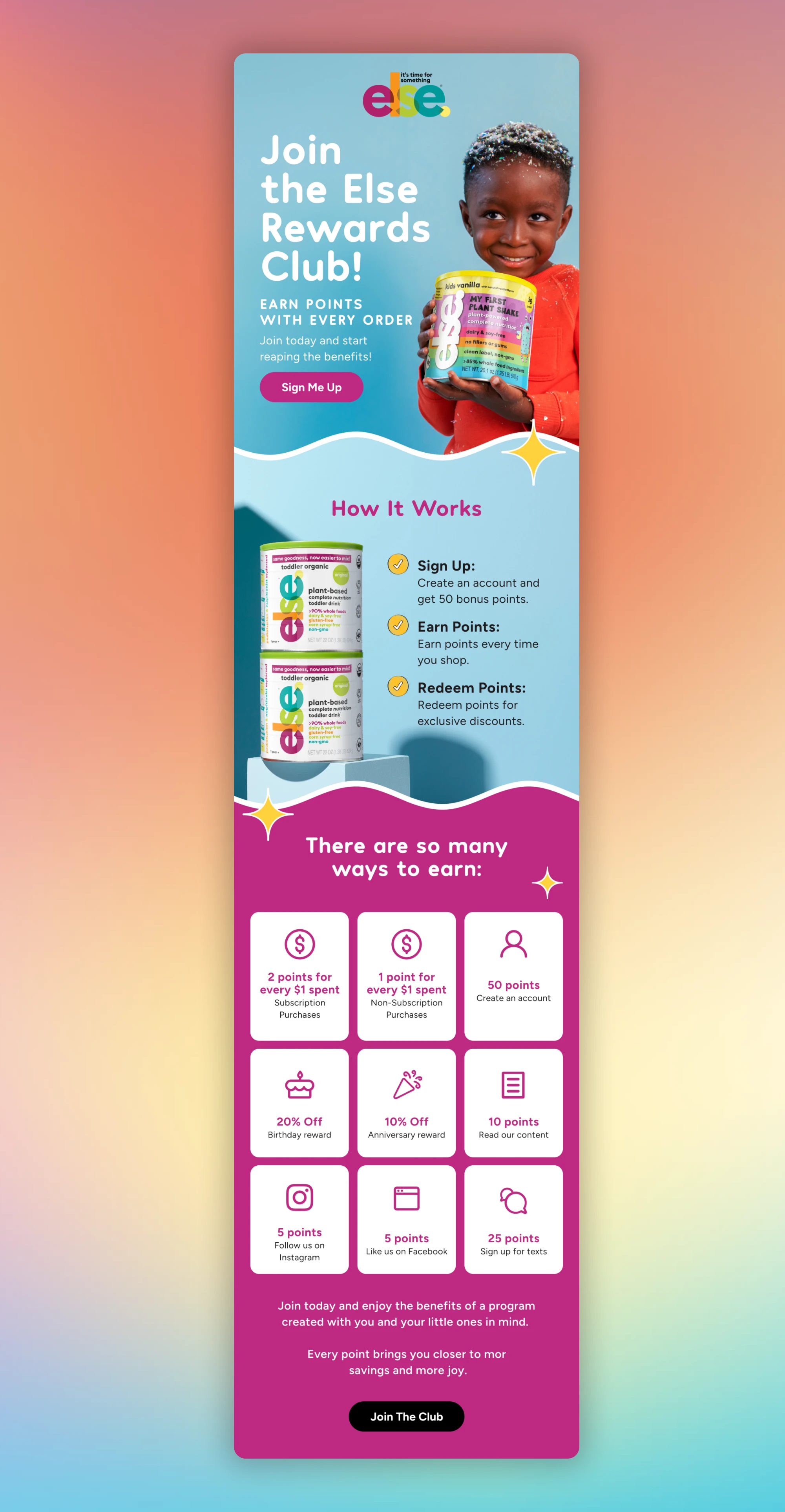
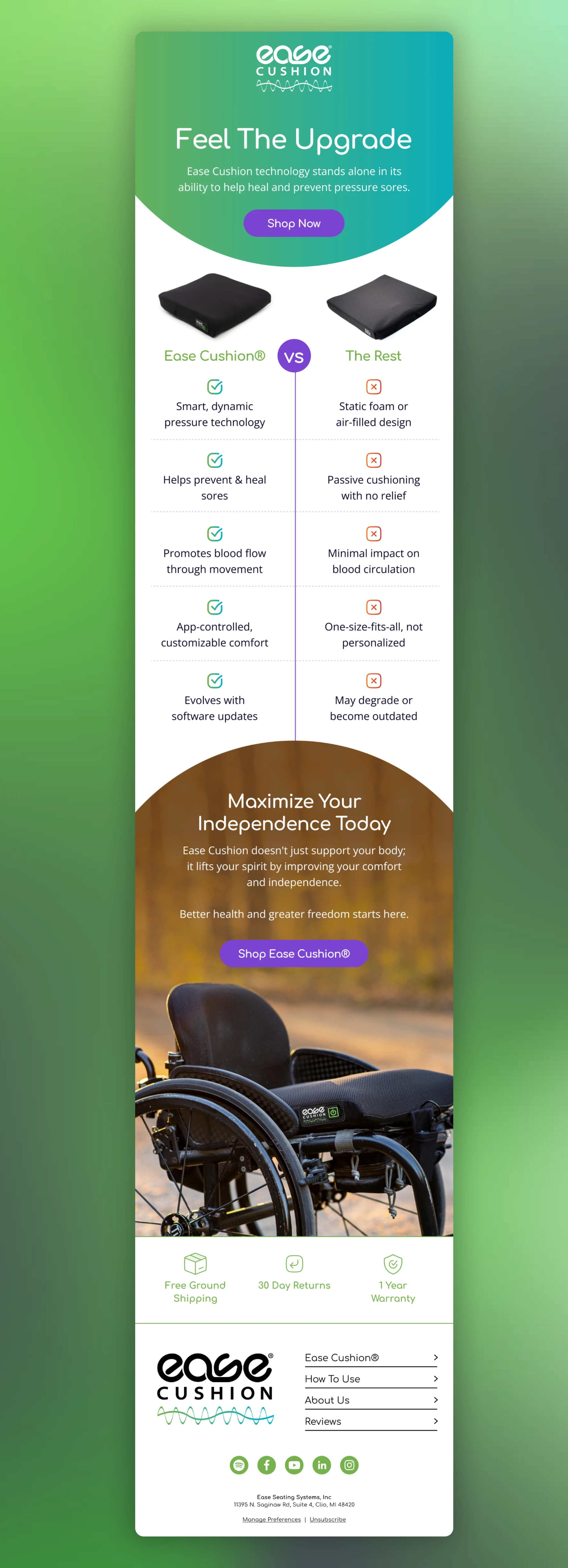
Here’s a quick example:
As you can see, the key points are scannable, so someone who is busy and just wants the key points can get exactly that.
All the info in a bitesize morsel.
Balancing Act
Find the right balance between copy and images.
Too much text can be overwhelming, while too many images can slow down load times and potentially trigger spam filters.
Aim for a good mix that tells your story effectively.
Also, mix things up.
Some emails can be text based entirely… but I’d personally aim these to be more personal type emails from the founder or a team member.
Your friend sends you emails in text form.
Use that native association people already have with a more personal touch in your strategy.
But when you’re sending a promotional email that has both text and images, be sure to mix things up well balance images with copy effectively.
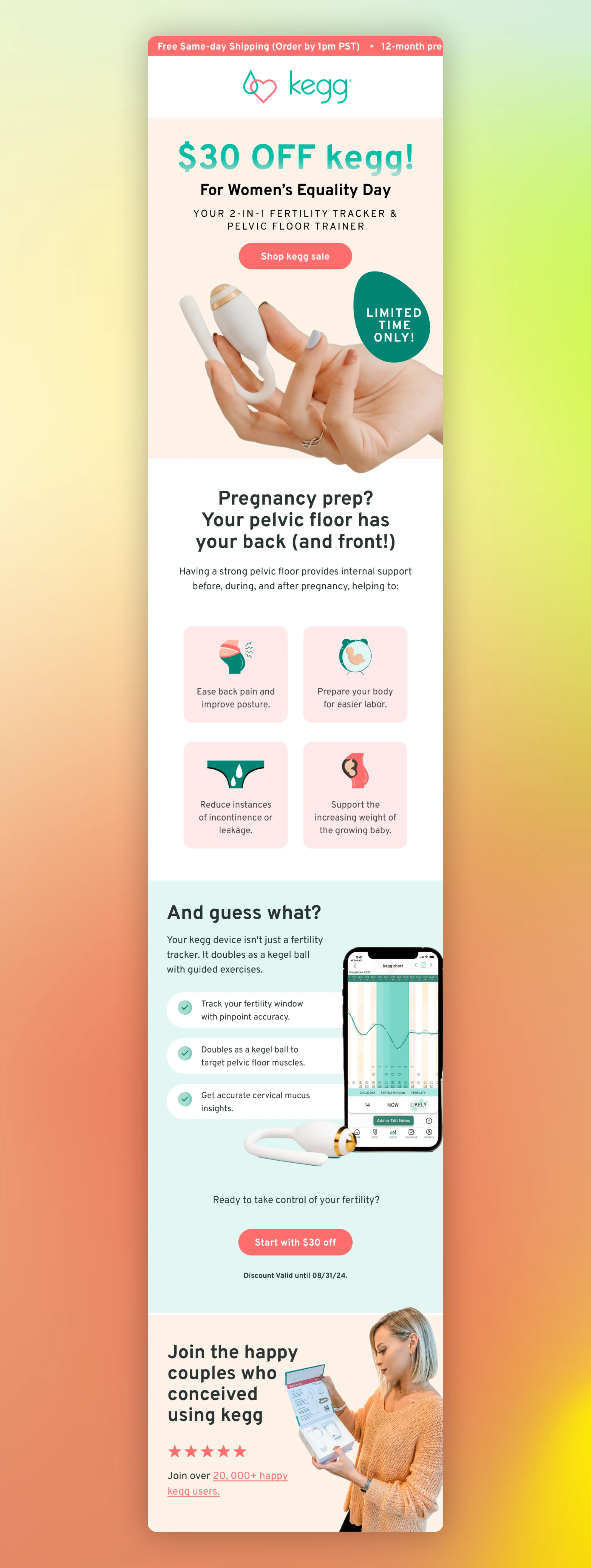
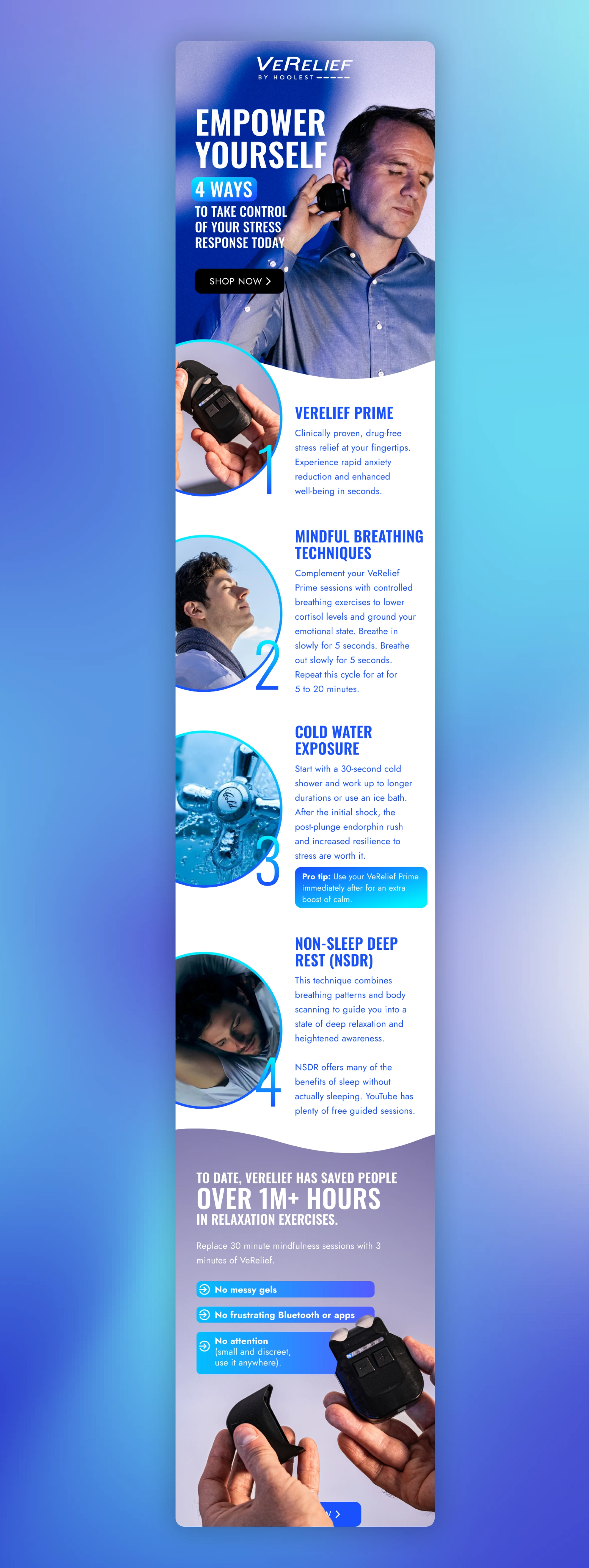
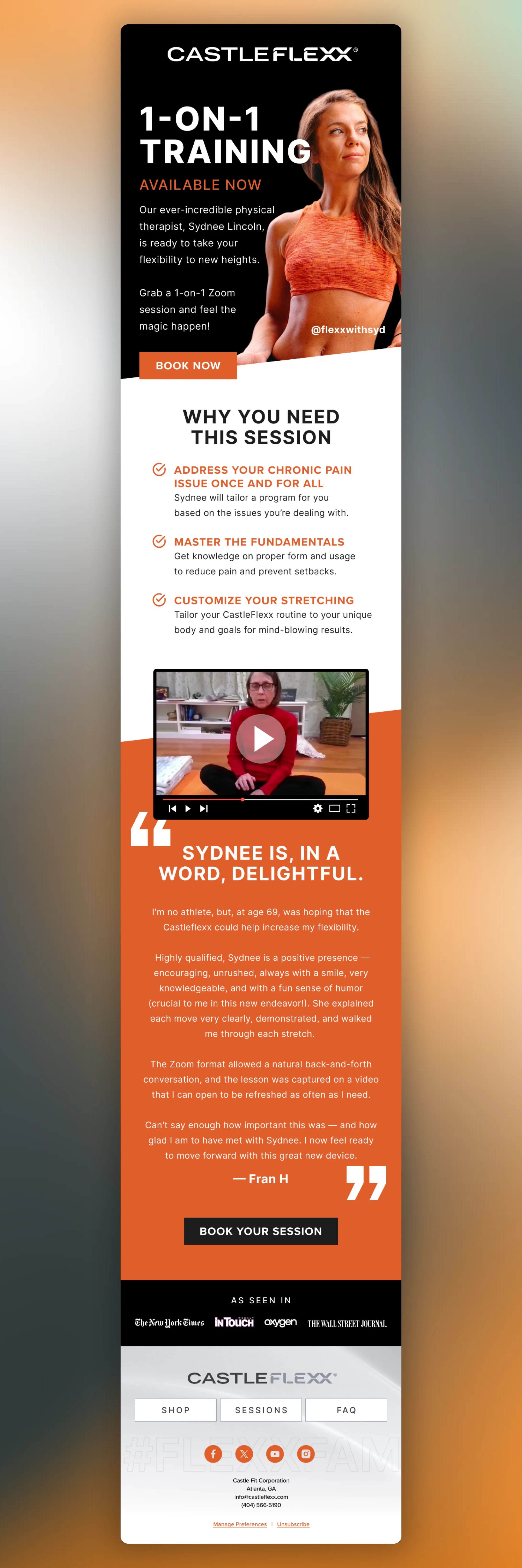
Here’s a quick visual example:
You can see here that the copy is concise and the images are well balanced.
Nothing is overwhelming and the email naturally flows.
It’s hard to define this in an actual ‘Here’s what to do’ - but once you see enough well-balanced emails, you end up getting a feel for it.
Calls-to-Action (CTAs):
CTA in the Header
Our designer's advice to “include a CTA in the header" is spot on.
Don't make your readers hunt for how to take action.
A clear CTA near the top of your email can drive immediate engagement.
Which translates directly to immediate sales.
Also, we’ve tested this time and time again.
Shop now tends to usually work better than other ‘cutesy’ or ‘creative’ CTAs.
Of course, there are times it doesn’t, and every brand is inherently different.
But from the tests we’ve done across numerous vertices, ‘Shop Now’ as a CTA just tends to…
Work.
It beats the vast majority of efforts where we have tried to be overly creative.
My hunch is because it’s native and what people are used to.
Design for Clicks
Make your CTAs stand out with contrasting colors, plenty of white space around them, and action-oriented text.
Again, ‘Shop Now’ as an action-oriented text works wonders.
Feel free to try and get creative with it. Just make sure you split test against ‘Shop Now’.
You may just come to the eventual conclusion that we did too.
Oh, and remember, your CTA should be easily tappable on mobile devices.
Aim for a minimum size of 44x44 pixels.
Testing and Optimization: Always Be Improving
A/B Testing
Don't guess what works.
Test it.
Try different subject lines, CTA placements, images, or copy to see what resonates best with your audience.
What one brand’s audience may resonate with could be the complete opposite of what your brand resonates with.
So it’s best to test it out rather than take anything as a holy grail.
Analyze and Adapt
Regularly review your email performance metrics.
Look at conversion rates, click rates and opens.
In that order.
Because clicks are hard to accurately measure since IOS 15, and the recent bot-flood with click rates is also starting to wane the accuracy of the metric.
The devil is in the details, and so is the right answer.
Your tests will tell you what direction to take and what to try next.
Conclusion
Designing eCommerce emails like an absolute champion is NOT about flashy graphics or geeking out over overly-complicated layouts.
Instead, understand your audience, respect the limitations of email clients, and create a clear message that drives action.
That’s the game plan and the goal.
Ultimately, the best email design is one that feels effortless to your reader.
They should be focused on your message and products..
Not struggling to navigate your email.
Now that you’re armed with the tools to build some high-converting emails…
I’m excited to see what you create.
Introduction
It’s no secret that email as a marketing channel has one of the highest ROIs possible.
We’ve all seen the stats floating around… “For every $1 spent on email marketing, brands gain $X” … whether it’s $36, $46, or whatever version of it you subscribe to…
The bottom line is that email marketing is extremely profitable.
But how do we take it one step further?
We’ve all had those conversations with brand owners who tell us email is absolutely CRUSHING it for them…
And sometimes it leaves us scratching our heads wondering what they’re doing differently.
While there are many things that go into making a thriving email channel, one of those things are the emails themselves.
The most optimal anatomy of an eCommerce email will always yield you better results than simply winging it.
That’s what I aim to share with you in this blog: How to create an eCom email like a pro.
If you action even a few of the tips I’m about to share, you'll naturally improve your open rates, click through rates and watch your email channel turn into one of your stronger marketing channels in the mix.
Let’s dive in.
Understanding the Canvas
Before we get into the actual anatomy of the emails, it’s crucial to understand the canvas we have to design on.
According to Litmus (2024), the current email client market share sees:
- Apple at the top, with around 48% market share.
- Gmail in second place with 35% market share.
- Outlook in third place with a far-behind 5%
No matter how far into the future you read this, it’s safe to assume the top 3 aren’t going to change anytime soon, unless something drastic happens.
What does that mean for you?
Design with these 3 clients in mind. If (especially) Apple and Gmail can’t open your emails, you’re in for some serious trouble.
Outlook, while far behind, still covers the third place, so the ideal scenario is to optimize for all 3.
On top of that, it’s crucial to know that:
Mobile is king when it comes to email opens. Most users open emails on their mobile.
What does that mean for you?
Your designs will stand a FAR better chance to convert if you design with a mobile-first approach.
This doesn’t mean you neglect desktop (at all) - rather lead with mobile-first in mind.
Now we’ve got the boring (but important) stats out the way, let’s get to the good stuff.
The designs.
Email Layout Best Practices
Simplicity really is your best friend when it comes to email layout.
Remember, you're not designing a website…
You're crafting a focused message that needs to be digested quickly, AND on multiple devices.
Now, there are a few principles to keep in mind:
Single-Column Layout
We’ve already mentioned that mobile is king. This means single-column layouts are your go-to.
They're easier to read on smaller screens and help maintain a clear hierarchy of information.
Multi-column layouts can work for desktop, but they tend to just fall apart on mobile.
Again, this isn’t a hard and fast rule, but just something to keep in mind when creating emails.
The Inverted Pyramid
Think about an inverted pyramid shape when you set out to structure your content.
Start with the most important information up top, then work your way down to the less important stuff and semantics.
Even if someone doesn't scroll all the way, they've gotten the main message.
That’s your goal.
Because people scan emails, unless they have a VERY high buying temperature.
White Space is Your Friend
As our designer wisely pointed out, "Well-balanced white space is SUPER important."
Don't be afraid of empty space. In fact, you should absolutely embrace it.
It gives your content room to breathe and makes your email more scannable.
A cluttered email is a deleted email.
That’s the mantra.
Clear Sections
Break your email into distinct sections using visual cues like lines, colors, or simply space.
This helps guide the reader's eye and makes the information more digestible.
Hopefully with these visual examples, you get the idea of what a good layout should look like.
But how do you make your email visually appealing and on-brand?
Let’s cover that next.
The Visual Stuff - Colors, Imagery, and Branding
Humans are extremely visual beings.
We often get a subconscious perception of something just by looking at it - and your brand is no different.
People WILL subconsciously judge the quality of your products, service and overall ability to help them through your representation of your branding.
Note the word ‘representation’.
Because many eCommerce brands have great branding, but it isn’t well-represented across all of their marketing channels.
And of all the audits we’ve done inside brand ESP (Email Service Provider) accounts, if there’s ONE area brands tend to continuously fall short…
You guessed it. It’s email.
Here are some crucial things to keep in mind when designing emails that represent your brand:
Color Theory in Action
Our designer hit the nail on the head with the importance of "Complementary Colors / Color Blocking."
Use your brand colors strategically to highlight important sections and create visual interest.
But remember, less is more when it comes to design.
Try not to turn your email into a rainbow explosion.
Here’s an example of how we’ve used complementary colors to highlight important sections, while tying everything together with branding in mind.
You can see how using the brands’ colors to highlight important sections causes a visceral effect across the entire creative.
Purposeful Imagery That Sells
"Good Imagery" isn’t just about picking pretty pictures.
It's about using images that tell a story, showcase your product and entice the reader.
It’s your chance at a memorable first impression, and creating a good visual experience.
High-quality product photos, lifestyle images that show your product in use and even well-designed graphics make a world of difference.
Seriously.
Here’s an example of high quality images that give a lift to the entire email.
It DOES make a difference.
Cohesive Branding
Your emails should be instantly recognizable as coming from your brand.
Use your logo, stick to your brand fonts (or you can use web-safe alternatives for emails), and maintain a consistent look and feel across all your marketing channels.
That is the absolutely key.
Cohesion across marketing channels.
If your ads look different, your website has a different twist, and your emails look a bit different to the rest…
It’s like playing Chinese whispers in your marketing.
And that leads to no sales.
Congruence in messaging across channels is everything…
And make sure not to underestimate congruence in branding across all of your channels too.
Hand in hand they’re an incredible combo for a tight, sales-generating funnel.
Less Is More When It Comes To Content Strategy
Short and Sweet Copy
As our designer emphasized, "Short and Concise Copy" is key.
Your readers are busy.
Respect their time by getting to the point quickly.
Use bullet points, short paragraphs, and clear headings to make your content easily scannable.
Here’s a quick example:
As you can see, the key points are scannable, so someone who is busy and just wants the key points can get exactly that.
All the info in a bitesize morsel.
Balancing Act
Find the right balance between copy and images.
Too much text can be overwhelming, while too many images can slow down load times and potentially trigger spam filters.
Aim for a good mix that tells your story effectively.
Also, mix things up.
Some emails can be text based entirely… but I’d personally aim these to be more personal type emails from the founder or a team member.
Your friend sends you emails in text form.
Use that native association people already have with a more personal touch in your strategy.
But when you’re sending a promotional email that has both text and images, be sure to mix things up well balance images with copy effectively.
Here’s a quick visual example:
You can see here that the copy is concise and the images are well balanced.
Nothing is overwhelming and the email naturally flows.
It’s hard to define this in an actual ‘Here’s what to do’ - but once you see enough well-balanced emails, you end up getting a feel for it.
Calls-to-Action (CTAs):
CTA in the Header
Our designer's advice to “include a CTA in the header" is spot on.
Don't make your readers hunt for how to take action.
A clear CTA near the top of your email can drive immediate engagement.
Which translates directly to immediate sales.
Also, we’ve tested this time and time again.
Shop now tends to usually work better than other ‘cutesy’ or ‘creative’ CTAs.
Of course, there are times it doesn’t, and every brand is inherently different.
But from the tests we’ve done across numerous vertices, ‘Shop Now’ as a CTA just tends to…
Work.
It beats the vast majority of efforts where we have tried to be overly creative.
My hunch is because it’s native and what people are used to.
Design for Clicks
Make your CTAs stand out with contrasting colors, plenty of white space around them, and action-oriented text.
Again, ‘Shop Now’ as an action-oriented text works wonders.
Feel free to try and get creative with it. Just make sure you split test against ‘Shop Now’.
You may just come to the eventual conclusion that we did too.
Oh, and remember, your CTA should be easily tappable on mobile devices.
Aim for a minimum size of 44x44 pixels.
Testing and Optimization: Always Be Improving
A/B Testing
Don't guess what works.
Test it.
Try different subject lines, CTA placements, images, or copy to see what resonates best with your audience.
What one brand’s audience may resonate with could be the complete opposite of what your brand resonates with.
So it’s best to test it out rather than take anything as a holy grail.
Analyze and Adapt
Regularly review your email performance metrics.
Look at conversion rates, click rates and opens.
In that order.
Because clicks are hard to accurately measure since IOS 15, and the recent bot-flood with click rates is also starting to wane the accuracy of the metric.
The devil is in the details, and so is the right answer.
Your tests will tell you what direction to take and what to try next.
Conclusion
Designing eCommerce emails like an absolute champion is NOT about flashy graphics or geeking out over overly-complicated layouts.
Instead, understand your audience, respect the limitations of email clients, and create a clear message that drives action.
That’s the game plan and the goal.
Ultimately, the best email design is one that feels effortless to your reader.
They should be focused on your message and products..
Not struggling to navigate your email.
Now that you’re armed with the tools to build some high-converting emails…
I’m excited to see what you create.